Here we go, another year. I’m ready, you’re ready (I hope), and so is my bag of chex mix which would be number 15 for the week.
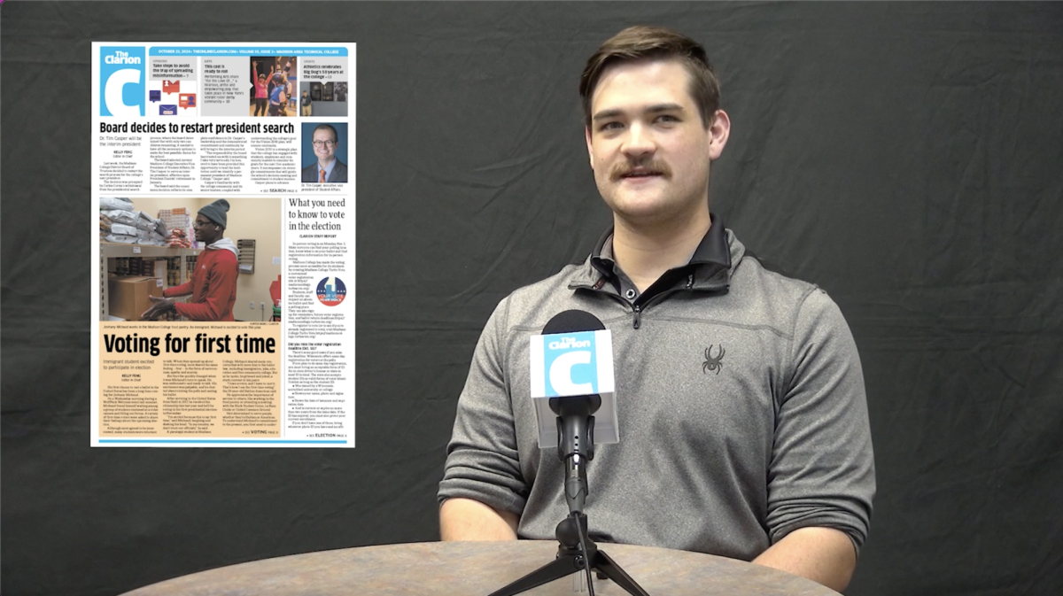
Some things are looking different here, aren’t they? First of all, the paper was completely redesigned this summer to reflect some coming changes for the year. And by redesigned, I mean a total of about three attempts to create a new logo and ways to make “vertical story formats” a new philosophy. Hopefully it works out.
Sparing you the minute details, right away you’ll see the top of page one now holds two to four flashes for stories inside the issue. Do you like it? No? Why not? Just let us know.
Some other changes include the section headers, which is just fancy talk for the road signs indicating where each section begins. We think it works, but we could always be wrong a few issues down the line. Let us know how we did!
Before I finish, I should mention that we are always looking for new staff to come in and help out. Drop us a visit to Room 130 at Truax or D125 at DTEC, or email us at clarioned@madisoncollge.edu. We’ll be sure to find a place for you here!
Now, if you’ll excuse me, I need a coma.


