Pride in the Center
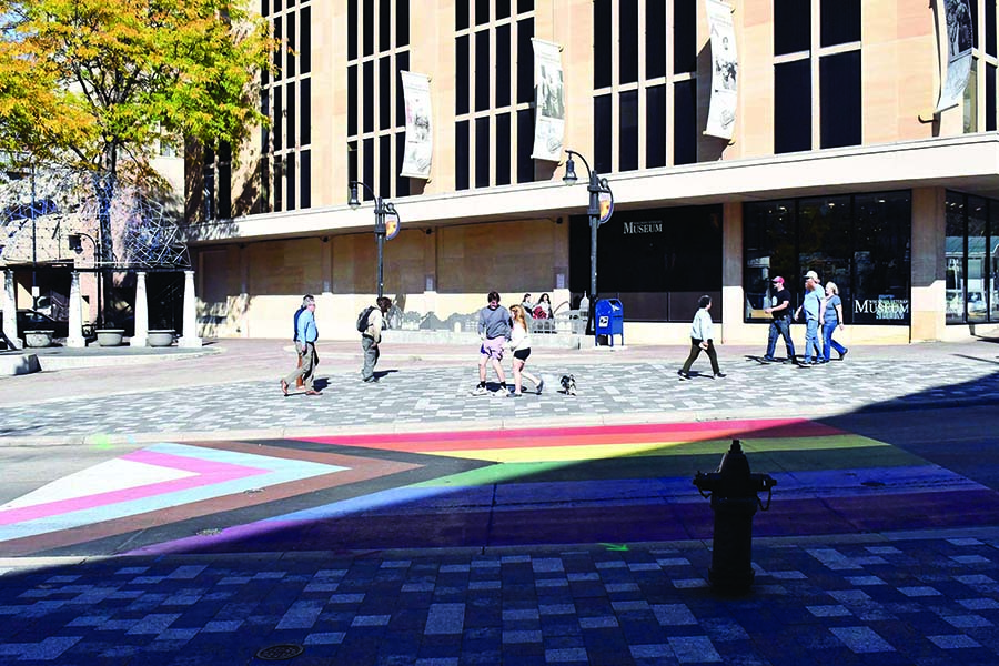
The Progress Flag has been installed on the end of State Street in Madison
The newly installed Progress Flag is at the end of State Street near the Capitol Square in Madison.
October 27, 2022
I am always so glad to live downtown by the Wisconsin State Capitol, and I do for many purposes. One of my more recent pleasant discoveries was when I was leaving the downtown library to go home.
My path home is a short and fairly direct one. I just cross the Capitol Square and turn down a single street. Each time I go between, I pass State Street at least once and this is where I found a wonderful surprise one night! Pointing towards the Capitol at the end of State Street, we now have a wonderful large art piece on the road: the Progress Flag.
This particular flag is a remake of what we imagine when we see the Pride Flag on most occasions. But then again, so are many. The Pride Flag has had a long and beautiful history of solidarity and each stripe holds a meaning. They always have, and all pride flags of all LGBTQ+ identities do. Not ever is a single stripe in color, order, tint, hue, shade, angle or any arrangement without greater meaning in any single flag in the LGBTQ+ community. This one is the same.
The “standard” modern Pride Flag is coded red for life, orange for healing, yellow for sun, green for nature, indigo for harmony and violet for soul.
The original creator Gilbert Baker (and collective LGBTQ+ members of San Francisco in 1978) had two additional colors, though they are not featured on the Progress Flag. Pink for sexuality, and turquoise for art.
The Progress Flag also features brown and black for People of Color or Non-White LGBTQ+ members and the colors of the Trans Flag, white for transitions, neutral genders and intersex people, light blue for boys and light pink for girls.
As I mentioned, there is even a meaning in the way the stripes are arranged. What truly signifies this flag as the Progress Flag is that starting from white to light pink, light blue, brown and then black, the colors take shape of an arrow pointing to the right. This indicates we are “on the right path” or “the forward path.” This symbol is being more and more commonly used to denote progress in flags, logos, icons and art which is a great unity to those who want progress.
This design, while being adopted widely, has had two major complaints. One being that it was unnecessary or took away from the original message and has quickly been shut down in each instance as our community has had its most prominent version be just that, a version.
The other complaint is that it actually is not inclusive enough! A new triangle takes the base on the left where it was once a white triangle. Now it is yellow with a purple circle. This is the flag, in fullness, for the Intersex community. For those who recognize or are a part of the Intersex community, this is a huge win. More importantly, it shows our acceptance of Intersex people as a whole; people that do not need to be altered in any way, nor does their flag. Now the white stripe in the Trans Flag is commonly referred to as being just the transitional area. Us Non-Binaries proudly have our own gorgeous flag and we use this proudly to claim a “third” main stage in the topic of gender, right alongside the Trans Community and the Cis Community.


